Abe, the new prime minister coming in announces an inflation target for the central bank, would that work?
BOJ people must be careful, once their own people get angry as bond yields fall short of inflation by a wide margin, this may trigger selling of bonds on a wholesale scale which would pull up interest rates long and short term, giving corporates much harder to maneuver their long term debt position or simply running into financial losses because of higher interest rates. Corporations large medium or small might not be able to survive on higher interest rates and tighter credit conditions, the failing of which will lead to even higher unemployment - in other words recession again.
29 December 2012
2013 Dow vs HSI, CRE, Crying wolf Crying foul
Crying wolf, Crying Foul
In hong kong, we heard from our HKMA head mr yam or mr chan in
2008/2009 that we should think twice before buying an apt, now we still hear
the same from mr chan. Both had been crying wolf for so many years that layman does not
know whether they should continue to abide by their advice.
Those who did not heed his warnings already reaped major
benefits from big ben’s QE and would not mind hearing some noise from him. But those
who heed his warnings are crying foul since without some physical assets in
hand, your cash is losing their value while your living costs have gone skyrocketed
plus the cash in the bank has no yield which is the major headache for many
people.
This is why you should never heed officials’ advice without
giving some serious thoughts behind it since officials are like stock brokers -
it is always time to buy stocks while for officials it is always time to be
cautious, at their angle only.
Commercial Real Estate
Here in hk, we might be coming to a wall for CRE although
the BSD and SSD in the residential market is driving investors to invest in CRE
and car parks, but recent vacancy in CRE which could be spotted in busy
districts like CWB, TST and MK and drop in demand from mainland tourists is a
forewarning that difficult times are ahead for CRE owners or landlords. A recent
visit to a realty broker for only half an hour, there are already two landlords
one residential who wants to sell his apt [even under SSD period] and one
commercial who wants to sell two units. In such a short period of time, you can
say it is coincidence that two are coming in to sell their properties or the market has turned
the corner if not for a long while at least for the short term. In a
slow market, if certain landlords have cash flow problems and would want to
sell into the market with limited buyers, only below market prices will
complete a deal. Such landmark prices can set a precedent for the market to
follow and will only drive more buyers away which could set the market up for
even lower prices.
However it is not all gloom and doom, my hunch is this is a
short reprieve for the real estate market to relieve some pressure which is not
bad. This is more like a 1994 set back which is a prelude to the final rally of
1997.
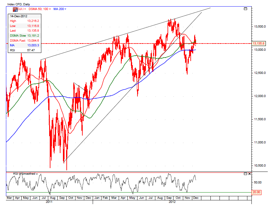
2013 Dow vs HSI
In the past, dow has outperformed hsi, would that change in
2013 – likely, why?
Dow’s chart has a rising wedge formation which points to a
serious correction while hsi chart has a round bottom extending for maybe a
year or more which is more solid.
27 December 2012
Bernie Madoff Letter to CNBC
downloaded from CNBC
A number of you have been asking my views on a couple of subjects that I am comfortable in going on the record, because they are not related to my case. there for(sic) the following are remarks that you are free to use for whatever value you feel are appropriate.
The issue of electronic trading has recently been focusing on the lack of transparency of the markets with the emergence of DARK POOLS.
This has now spread to the recent acquisition of the NYSE . While I have always been an advocate of electronic trading due to the efficiency the lower costs they bring o the markets, I am nit (sic) a fan of the lack of transparency the DARK POOLS create.
It is important to examine why there has been this growing interest in the use of dark pools. Markets have always focused on the speed with which information becomes available. Of course this information can be composed of various types.
It could be corporate developments like earnings or mergers or it can be information regarding the placements of buy and sell orders and who is placing these orders. It is the latter information that has created the interest in the dark pools.
Institutions have always attempted to guard this buy and sell information from exposure to the market for fear of being FRONT RUN. Certainly they are entitled to have this right of confidentiality.
This being said, the more secret this information. The more valuable this information is to those that can obtain it. Therein lies the problem. It is naive to think that there will be no leakage of this information.
Although one would be lead to believe that with the recent spate of Insider trading prosecutions, that insider trading is a new development. This is false. It has been present in the market forever, but rarely been prosecuted. The same can be said for front running of orders.
The other area of discussion involves the growth of hedge funds, particularly feeder funds. In spite of the early held belief. of which I was of this opinion, that the extra layer of costs related to commissions and profit sharing that went along with feeder funds.
They have continued to grow. It has been this additional layer of costs that have created the need for more risk to be taken to earn worthwhile returns. This has created a minefield of regulatory problems involving the very reasons that the desire for a lack of transparency has grown.
Both of these areas are going to be the greatest challenge that both the industry and the regulators are going to face .
15 December 2012
DOW, APPLE, GOLD and the ECONOMY

click chart for a better view.
apple chart has a typical head n shoulder formation, it wont be long before it falls deeper, read this blog on earlier discussion of the final settlement pricing of apple. there could be some struggling usually at the neckline 520 which has now been broken. if apple stays below 500 for three weeks or more, not a good sign.
the dow is also not looking to reach new highs above 14000 given the formation of a rising wedge which can bring dow down much harder, the pullback has already occurred, thus it is not likely to go up much higher.
economy will go slower no matter fiscal cliff or not as it will cut into consumer spending one way or the other, this is why there is such a rush to QE to avoid economy contracting too fast once it is over the cliff or a deal is struck to limit expenses and raise taxes.
gold prices is telling the same story that even current QE cannot sustain prices above 1700. it usually is a precursor of the price of oil, it has done poorly for the past few months, my hunch is oil will fall further and gold may go down with it.
22 November 2012
Link Reit, Hysan, HK Real Estate

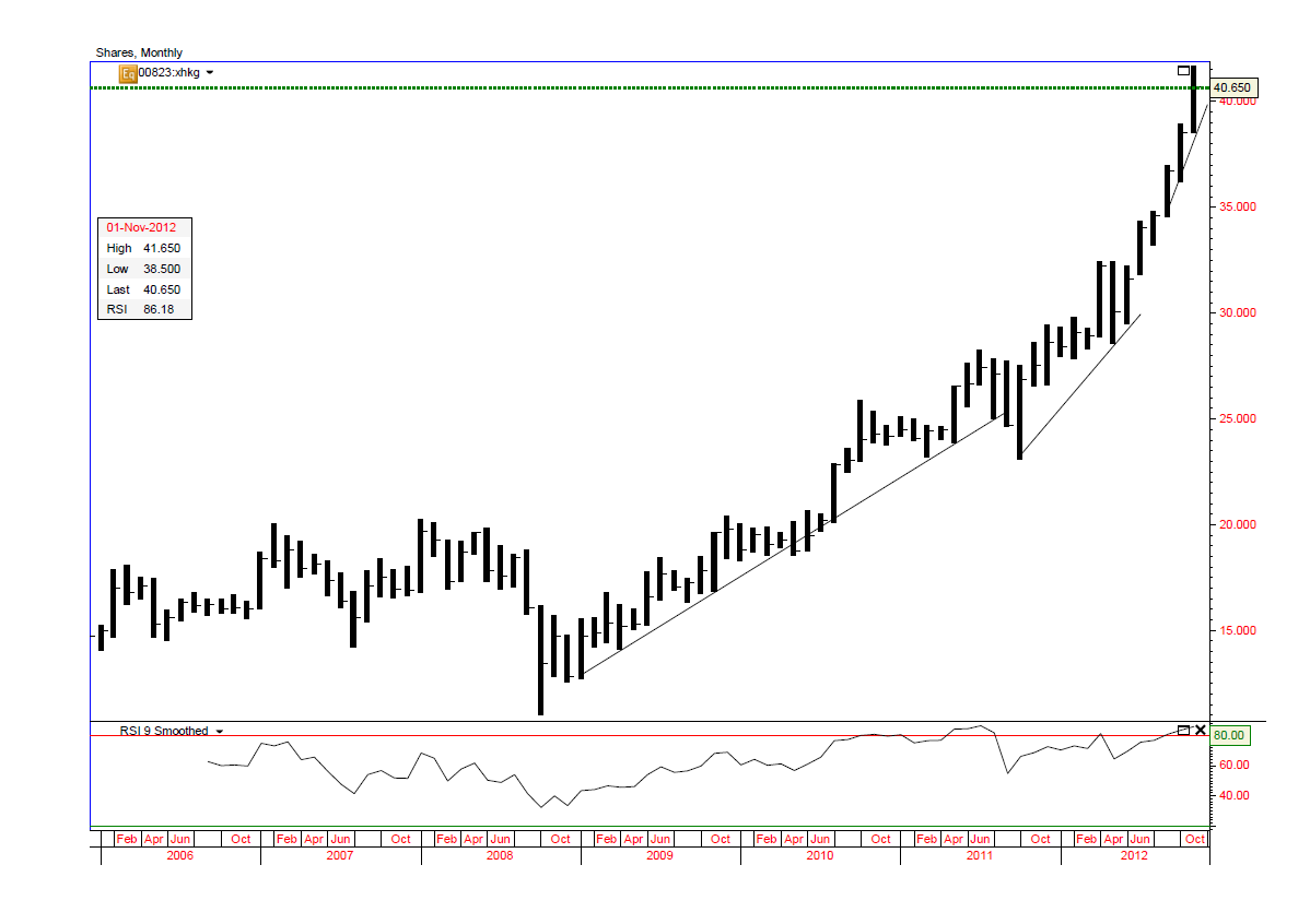
the link reit may be peaking out soon, the three phase of rising trend is exhausting the buying power.
now look at hysan, it looks like there is a rising wedge forming which could lead to a drastic fall if it does not break away from the rising wedge soon ie shooting up past 37.
both companies are similar in nature only that link still has more room for growth and improvement to its 30 years old portfolio.
my hunch is it will happen in less than 6 months.
another indication that real estate might be reaching a peak is that
- the new duties BSD and SSD will have a hard impact on residential transactions while channeling funds to commercial realty and car parks which recently has reached into stratosphere
- BSD will take away the support for the market when it falls and SSD prevents marginal buyers purchasing apartments although prices might then become more reasonable but their jobs are now at risk
- on QRW alone between Possession Street and Queen Street which is only might be a 100m long, there are more than 5 property agents on street level, also an indication that this will not be long before a set back is on the way or might be round the corner already.
17 November 2012
Apple and Dow, HSI


click on chart for a better view
not long back, we talked about apple, now it is apple again, why?
because it was predicted earlier that apple will soon top out, now it has fallen 20% from peak price, it is likely to hit bottom soon and will end the recent dow fallout.
the reverse [downward] rsi vs the price uptrend spells trouble for apple and the fallout is real fast, but rsi is now hitting low range and will soon rise or stay flat.
then where will it land?
looking at the chart, the year began with apple at 426 and rose almost 70%, so anyone who own apple will have their shares grown 70%+ if they have not sold their shares in the past year end.
if it is going to form a head shoulders pattern, it has reached the neckline, my hunch is between 30%-40% from top ie 420-490. last price is 527.
watch out for a rising rsi vs a price downtrend to confirm the uptrend breakout, just like the downtrend breakout.
as there is a lot of speculation that the capital gains tax will rise from the current 15% back up to previous level of 20% in 2013, but a more likely scenario is 28% which has been the case for a long time in history at this level. if you hold stocks like apple with plenty of profits in hand, you would like the profits be taxed at 15% not 28%, this is one reason why apple has fallen so hard and dow's 1000 pt fall. we have seen tons of big wig investors unloading, one from facebook's board selling more than half his angel investments, lucasfilm owner selling out to disney, a key investor sold all his hp shares.
some guys will buy back their shares if the stock is a good one and hard hit. hp is not among it though.
in hk, we will soon have picc going for ipo, the dates are 22 nov to commence ipo applications and 5 dec listing, this may soon spell the end of the hsi downtrend.
21 October 2012
HK Real Estate, GDP, Velocity of Money, M Base [Part 2]...


i have privately discussed these topics with various readers and they should have some familiarity with the blog [Part 1] right before this one.
the first chart here is chart 4 of Part 1, click on the charts for a better view.
HK Real Estate
if you look at chart 4 mentioned in Part 1 of the title, you will read then in 2008 the M base is only 800, now we have 2600 and that is 3 times as much. back in 2008, most apartments are in the range of hkd4500-5000 per sq ft, with a doubling of M base, you will surely have the real estate prices lifted towards a double or not far from it. this assumes a lot of money was channeled in that direction and it surely has since there are no yields to be found at the bank for deposits. but if you look further the M base expanded 3 times as much.
GDP
M base x Velocity of M = GDP, with so much debt and very strict lending standards, there is no way for the market to invest and also the euro crisis is putting a dent to investments, so the velocity of money trends lower thus the fed has to increase the money supply to make sure GDP is not slowing too much, yet a lot of the GDP generated is at the expense of the middle class which constrains spending and thus further investments as there is no revenue growth by volume but by price alone.
velocity of money is how many times the money base cycles through the economy, if people buy more stuff, thus more transactions and corps have more revenue and profits, so they can raise prices, increase salaries/wages and the cycle goes on. now we have the reverse due to deleveraging, people spends less on average, so corps cut back and limit wage increases though they can still maintain profits by cutting back faster than the drop in revenue and also reverse provisions.
HK Real Estate, GDP, Velocity of Money, M Base [Part 1]
the following is an article from a newsletter.
most of you might not be interested in the full article, then read the blog following this one which will give you some insights to the above topics with the subject.
Hoisington Investment Management
Quarterly Review and Outlook
Third Quarter 2012


most of you might not be interested in the full article, then read the blog following this one which will give you some insights to the above topics with the subject.
Hoisington Investment Management
Quarterly Review and Outlook
Third Quarter 2012
Growth Recession
Entering the final quarter of the year, domestic and global
economic conditions are extremely fragile. Across the globe, countries
are in outright recession, and in some instances where aggregate growth
is holding above the zero line, manufacturing sectors are contracting.
The only issue left to determine is the degree of the downturn
underway. International trade is declining, so weaknesses in different
parts of the world are reinforcing domestic deteriorations in economies
continents away. With this global slump at hand, a highly relevant
question is whether the U.S. can escape a severe recession in light of
the following:
a) the U.S. manufacturing sector that paced domestic economic
growth over the past three years has lapsed into recession;
b) real income and the personal saving rate have been slumping in the face of an interim upturn in inflation, and
c) aggregate over-indebtedness, which is the dominant negative
force in the economy, has continued to move upward in concert with
flagging economic activity.
New government initiatives have been announced, particularly by
central banks, in an attempt to counteract deteriorating economic
conditions. These latest programs in the U.S. and Europe are similar to
previous efforts. While prices for risk assets have improved,
governments have not been able to address underlying debt imbalances.
Thus, nothing suggests that these latest actions do anything to change
the extreme over-indebtedness of major global economies.
To avoid recession in the U.S., the Federal Reserve embarked on
open-ended quantitative easing (QE3). Importantly, the enactment of
QE3 is a tacit admission by the Fed that earlier efforts failed, but
this action will also fail to bring about stronger economic growth.
Commodity Market Reactions
Commodity markets have risen in reaction to the Federal
Reserve’s liquidity injections into the banking sector (Table 1). From
the time the press reported that the Fed was moving toward QE1 & QE2
commodity prices surged. During QE1 & QE2 wholesale gasoline
prices jumped 30% and 37%, respectively, and the Goldman Sachs Commodity
Food Index (GSCI-Food) rose 7% and 22%, respectively. From the time
the press reported that the Fed was moving toward QE3, both gasoline and
the GSCI Food index jumped by 19%, through the end of the 3rd quarter.
Two theoretical considerations account for the rise in
commodity prices during QE3. The first is the expectations effect.
When the Fed says they want higher inflation, the initial reaction of
the markets is to “go with”, rather than fight the Fed. The second
linkage, which is the expanded availability of funds used for collateral
(margin), was identified and subsequently confirmed by Newedge
economist, Dr. Rod McKnew, who stated, “In a world of advanced
derivatives, high cash balances are not required to take speculative
positions. All that is required is that margin requirements be
satisfied.” Thus, when the Fed massively expanded reserve balances in
QE1 and QE2, margin risk was minimized for those market participants who
wished to take positions consistent with the Fed’s goal of higher
inflation, and who had either direct or indirect access to the Fed’s
hugely inflated reserve balances. The Apr
il 22,
2011 issue of Grant’s Interest Rate Observer documented support for
McKnew’s insight. They asked Darrell Duffie, the Dean Witter
Distinguished Professor of Finance at the Graduate School of Business at
Stanford University, whether excess reserves could serve as collateral
for futures and derivatives transactions. Dr. Duffie’s answer was
“acceptable collateral is a matter of private contract, but reserve
deposits are virtually always acceptable.”
Devastation for Households
The unintended consequence of these Federal Reserve actions,
however, is to actually slow economic activity. The CPI rose
significantly in QE1 and QE2 (Chart 1). These price increases had a
devastating effect on worker's incomes (Chart 2). Wages did not
immediately respond to commodity price changes; therefore, there was an
approximate 3% decline in real average hourly earnings in both
instances. It is true that stock prices also rose along with commodity
prices (S&P plus 36% and 24%, respectively, in QE1 and QE2).
However, median households hold a small portion of equities, and thus
received minimal wealth benefit.
Wealth Effect
Despite the miserable economic results in QE1 and QE2, we now
have QE3. Fed Chair Ben Bernanke and other Fed advocates believe the
“wealth effect” of QE3 will bring life to the economy. The economics
profession has explored this issue in detail. Sydney Ludvigson and
Charles Steindel in How Important is the Stock Market Effect on Consumption
in the FRBNY Economic Policy Review, July 1999 write: “We find, as
expected, a positive connection between aggregate wealth changes and
aggregate spending. Spending growth in recent years has surely been
augmented by market gains, but the effect is found to be rather unstable
and hard to pin down. The contemporaneous response of consumption
growth to an unexpected change in wealth is uncertain, and the response
appears very short-lived.” More recently, David Backus, economic
professor at New York University found that the wealth effect is not
observable, at least
for
changes in home or equity wealth.
A 2011 study in Applied Economic Letters entitled, Financial Wealth Effect: Evidence from Threshold Estimation
by Sherif Khalifa, Ousmane Seck and Elwin Tobing found “a threshold
income level of almost $130,000, below which the financial wealth effect
is insignificant, and above which the effect is 0.004.” This means a $1
rise in wealth would, in time, boost consumption by less than one-half
penny.
These three studies show that the impact of wealth on spending
is miniscule—indeed, “nearly not observable.” How the Fed expects the
U.S. to gain any economic traction from higher stock prices when rising
commodity prices are curtailing real income and spending is puzzling.
This is particularly relevant when econometricians have estimated that
for every dollar of gained real income, consumption will rise by about
70 cents. Conversely, the Fed actions are causing real incomes to
decline, which has a 70-cent negative impact on spending for every
dollar loss. Compare that with the 0.004 positive impact on spending
for every one-dollar increase in wealth. Former Fed Chairman, Paul
Volcker, summarized the new Fed initiative as sufficiently and
succinctly as anyone when he stated that another round of QE3 “is
understandable, but it will fail to fix the problem.”
An International Corollary
The unintended consequences of QE3 could also serve to worsen
and undermine global economic conditions already under considerable
duress. When the Fed actions lead to higher food and fuel prices, the
shock wave reverberates around the world, with many foreign economies
being hit adversely. When prices of basic necessities rise, the
greatest burden is on those with the lowest incomes since more of their
budget is allocated to the basic necessities such as food and fuel.
Thus, a jump in daily essentials has a more profound negative impact on
living standards in economies with lower levels of real per capita
income.
Can the Fed Create Demand?
Can all the trillions of dollars of reserves being added to the
banking system move the economy forward enough to eventually create a
higher level of aggregate spending? Our analysis of the aggregate
demand curve and its determinants indicate they cannot. The question is
whether monetary actions can shift this aggregate demand (AD) curve out
to the right from AD0 to AD1 (Chart 3). If this were possible, then
indeed the economy would shift to a higher level of prices and real GDP.
The AD curve is equal to planned expenditures for nominal GDP
since every point on the curve is equal to the aggregate price level
(measured on the vertical axis of the graph), multiplied by real GDP
(measured on the horizontal axis of the graph). We know that GDP is
equal to money times its turnover or velocity, which is called the
equation of exchange as developed by Irving Fisher (Nominal GDP = M*V).
Deconstructing this formula, M (or M2) is comprised of the
monetary base (currency plus reserves) times the money multiplier (m).
The Federal Reserve has control over the monetary base since its balance
sheet is the dominant component of the monetary base. However, the Fed
does not directly control the money supply. The decisions of the
depository institutions and the non-bank public determine the money
multiplier (m). M2 thus equals the monetary base multiplied by the
money multiplier. The monetary base, also referred to as high powered
money, has exploded from $800 billion in 2008, to $2.6 trillion
currently, but the money multiplier has collapsed from 9.3 to 3.9 (Chart
4). Therefore, the money supply has risen significantly less than the
increase in the Fed’s balance sheet, with the result that neither rapid
gains in real GDP nor inflation were achieved. Indeed, with the
exception of transitory episodes, inflation re
mains
subdued and the gain in GDP in the three years of this expansion was the
worst of any recovery period since World War II.
The other element that is required for the Fed to shift the
aggregate demand curve outward is the velocity or turnover of money over
which they also have no control. During all of the Fed actions since
2008 the velocity of money has plummeted and now stands at a five decade
low (Chart 5).
The consequence of the Fed’s lack of control over the money
multiplier and velocity is apparent. The monetary base has surged 3.3
times in size since QE1. Nominal GDP, however, has grown only at an
annual rate of 3%. This suggests they have not been able to shift the
aggregate demand curve outward. Nor, with these constraints, will they
be any more successful in shifting that curve under the present
open-ended QE3. Increased aggregate demand and thus rising inflation is
not on the horizon.
[For a more complete discussion of the complexities of the
movement of the aggregate supply and aggregate demand curves please see
the APPENDIX.]
Treasury Bonds
As commodity prices rose initially in all the QE programs,
long-term Treasury bond yields also increased. However, those higher
yields eventually reversed and generally continued to ratchet downward,
reaching near record lows. The current Fed actions may be politically
necessary due to numerous demands for them to act to improve the clearly
depressed state of economic conditions. However, these policies will
prove to be unproductive. Economic fundamentals will not improve until
the extreme over-indebtedness of the U.S. economy is addressed, and this
is in the realm of fiscal, not monetary policy. It would be more
beneficial for the Fed to sit on the sidelines and try to put pressure
on the fiscal authorities to take badly needed actions rather than do
additional harm. Until the excessive debt issues are addressed, the
multi-year trend in inflation, and thus the long Treasury bond yields
will remain downward.
APPENDIX
One of the most important concepts in macroeconomics is
aggregate demand (AD) and aggregate supply (AS) analysis – a highly
attractive approach that is neither Keynesian, monetarist, Austrian, nor
any other individual school, but can be used to illustrate all of their
main propositions. However, before detailing the broader
macroeconomics associated with the movement of the AD and AS curves, it
is important to understand microeconomic supply and demand curves. This
can best be illustrated through the recent impact the Fed’s decisions
had on commodity prices. In the commodity market, like individual
markets in general, the demand curve is downward sloping, the supply
curve is upward sloping, and where they intersect determines the price
of the commodity and the quantity supplied/demanded. The micro-demand
curve slopes downward because as the price of an item rises, the
quantity demanded falls due to income and substitution effects (
buyers
can shift to a substitute product). The micro-supply curve slopes
upward since producers will sell more at higher prices than lower ones.
Both supply and demand schedules are influenced by expectation,
fundamental, and liquidity considerations. When the Fed says that they
want faster inflation and that they are going to take steps to achieve
this objective, both economic theory and historical experiences indicate
that commodity prices will rise, at least transitorily (as seen with
the surge in commodity prices after the announcement of QE1, QE2 and
QE3). Information and liquidity available to the buyers is also
available to the suppliers, so by saying faster inflation is ahead,
suppliers are encouraged to reduce or withhold current production or
inventories, moving the supply curve inward. Thus, in the commodity
market, the Fed action spurs an outward shift in the micro-demand curve
along with an inward shift of the micro-supply curve, producing higher
prices and lower quantities. These microeconomic developments transmit
to the broader economy, which we will now trace through A
D and
AS curves.
The AD curve slopes downward and indicates the amount of real
GDP that would be purchased at each aggregate price level (Chart 6).
Aggregate demand varies inversely with the price level, so if the price
level moves upward from P0 to P1, real GDP declines from Y0 to Y1. When
the price level rises, real wages, real money balances and net exports
worsen, thereby reducing real GDP. The rationale for the downward
sloping AD curve is thus quite different from the sloping of the
micro-demand curve since substitution effects are not possible when
dealing with aggregate prices. In order to improve real GDP with a
rising price level, the AD curve would need to be shifted outward and to
the right (from AD0 to AD1). And as detailed in the letter, the Fed is
not capable of shifting the entire AD curve.
The AS curve slopes upward and indicates the quantity of GDP
supplied at various price levels. The positive correlation between
price and output in micro and macroeconomics is the same since the AS
curve is the sum of all supply curves across all individual markets.
When Fed policy announcements shock commodity markets, the AS curve
shifts inward and to the left (from AS0 to AS1). This immediately
causes a reduction in real GDP (the difference between Y0 and Y1) as the
price increases by the difference between P0 and P1 (also Chart 6).
Furthermore, as discussed in the letter, lower GDP as a result of higher
prices reduces the demand for labor and widens the output gap, setting
in motion a negative spiral.
For Fed policy to improve real GDP, actions must be taken that
either (1) shift the entire demand curve outward (to the right), or (2)
do not cause an inward shift of the AS curve that induces an adverse
movement along the AD curve. Accordingly, the Fed is without options to
improve the pace of economic activity.
20 October 2012
7 traits to avoid
A good article from Financial Post.

Investors are ‘normal,’ not rational,”
says Meir Statman, one of the leading thinkers in behavioral finance.
Behavioral finance aims to better
understand why people make the financial decisions they do. And it’s a
booming field of study. Top behavioral finance gurus include Yale’s Robert Shiller
and GMO’s James
Montier.
It’s also a crucial part of the Chartered
Financial Analyst (CFA) curriculum, a course of study for financial
advisors and Wall Street’s research analysts.
We compiled a list of the seven most
common behavioral biases. Read through them, and you’ll quickly realize
why you make such terrible financial decisions
Your
brain thinks it’s great at investing
Overconfidence may be the most obvious behavioral
finance concept. This is when you place too much confidence in your
ability to predict the outcomes of your investment decisions.
Overconfident investors are often
underdiversified and thus more susceptible to volatility.
Source: CFA Institute
Your
brain doesn’t know how to handle new information.
Daniel Goodman / Business Insider.com
Anchoring is related to overconfidence. For
example, you make your initial investment decision based on the information
available to you at the time. Later, you get news that materially affects
any forecasts you initially made. But rather than conduct new analysis,
you just revise your old analysis.
Because you are anchored, your revised
analysis won’t fully reflect the new information.
Source: CFA Institute
Your
brain is too focused on the past.
Lewis & Clark & Sacagawea
A company might announce a string of
great quarterly earnings. As a result, you assume the next earnings
announcement will probably be great too. This error falls under a broad
behavioral finance concept called representativeness: you incorrectly
think one thing means something else.
Another example of representativeness is
assuming a good company is a good stock.
Source: CFA Institute
Your
brain doesn’t like to lose.
Bob Owen via Flickr
Loss aversion, or the reluctance to accept a loss, can
be deadly. For example, one of your investments may be down 20% for good
reason. The best decision may be to just book the loss and move on.
However, you can’t help but think that the stock might comeback.
This latter thinking is dangerous because
it often results in you increasing your position in the money losing
investment. This behavior is similar to the gambler who makes a series of
larger bets in hopes of breaking even.
Source: CFA Institute
Your
brain remembers everything.
How you trade in the future is often
affected by the outcomes of your previous trades. For example, you may
have sold a stock at a 20% gain, only to watch the stock continue to rise after
your sale. And you think to yourself, “If only I had waited.” Or
perhaps one of your investments fall in value, and you dwell on the time when
you could’ve sold it while in the money. These all lead to unpleasant
feelings of regret.
Regret minimization occurs when you avoid investing
altogether or invests conservatively because you don’t want to feel that
regret.
Source: CFA Institute
Your
brain likes to go with the trends.
RBC Capital Markets
Your ability to tolerate risk should be
determined by your personal financial circumstances, your investment time
horizon, and the size of an investment in the context of your portfolio. Frame
dependence is a concept that refers to the tendency to change risk
tolerance based on the direction of the market. For example, your
willingness to tolerate risk may fall when markets are falling.
Alternatively, your risk tolerance may rise when markets are rising.
This often causes the investor to buy
high and sell low.
Source: CFA Institute
Your
brain is great at coming up with excuses.
Sometimes your investments might go sour.
Of course, it’s not your fault, right? Defense mechanisms in the form of
excuses are related to overconfidence. Here are some common excuses:
- ‘if-only’: If only that one thing hadn’t happened, then I would’ve been right. Unfortunately, you can’t prove the counter-factual.
- ‘almost right’: But sometimes, being close isn’t good enough.
- ‘it hasn’t happened yet’: Unfortunately, “markets can remain irrational longer than you and I can remain solvent.”
- ‘single predictor’: Just because you were wrong about one thing doesn’t mean you’re going to be wrong about everything else, right?
- ‘dog ate my research’**
Source:
CFA Institute
14 October 2012
DOW, big rally?

the dow suggests a strong rally, why? because the dow breaks out of the purple neckline for quite some months already.
since this is a monthly chart, expect quite some bumps ahead, the nearest one is the rising wedge which might pull the dow down significantly so it does not look like a breakout above the neckline, then all of a sudden, it rallies up to caught everyone with big surprises.
how will hsi behave? well, that is for the next update.
Subscribe to:
Posts (Atom)

